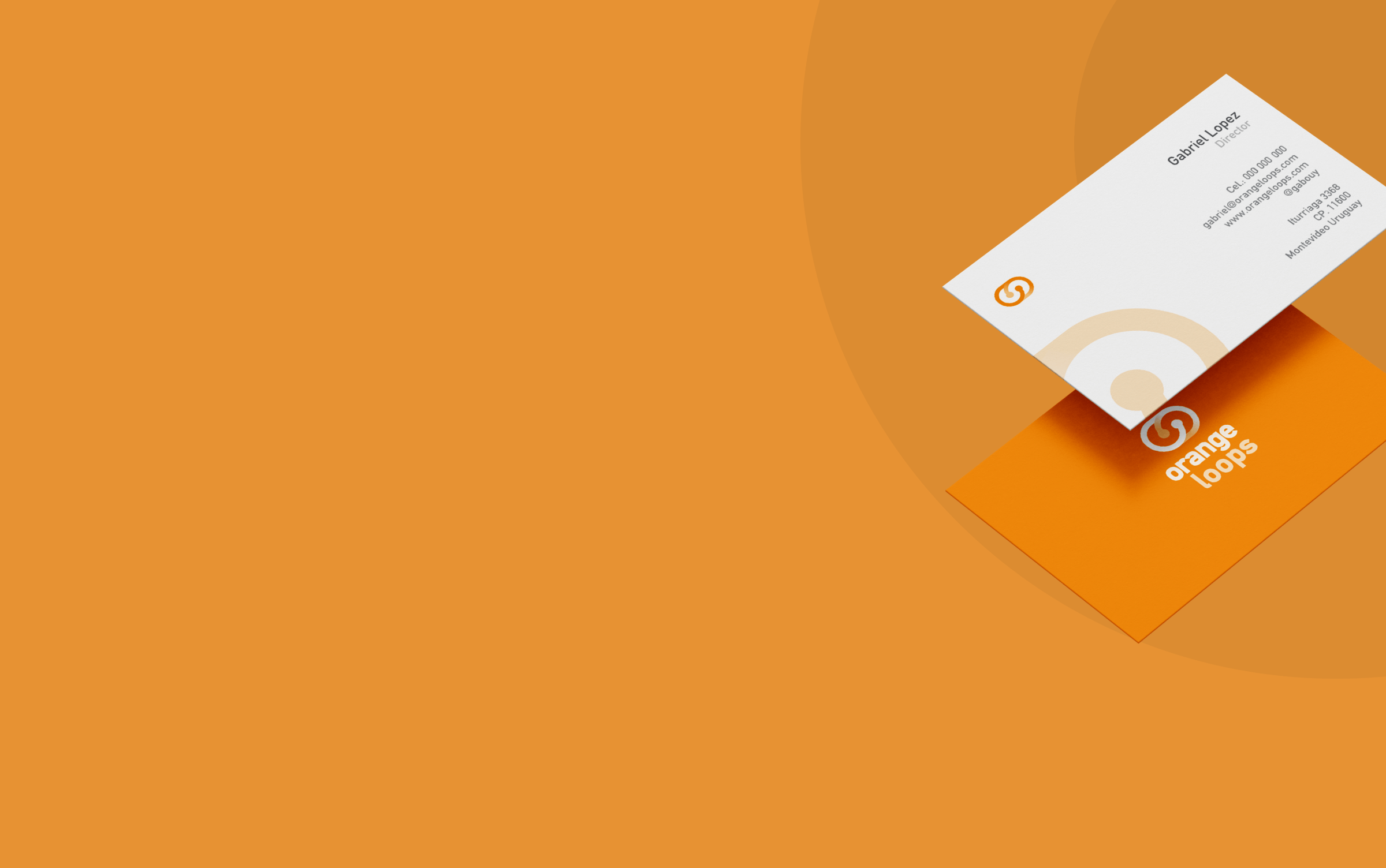
Branding creation for OrangeLoops.
Began with gathering information about the company's objectives and desired brand concepts through stakeholder interviews. The name OrangeLoops was already established, representing the iterative process of obtaining better ideas, products, and results.
After defining the objective, various proposals were explored for graphic representation, aiming to denote the loop and repetition.
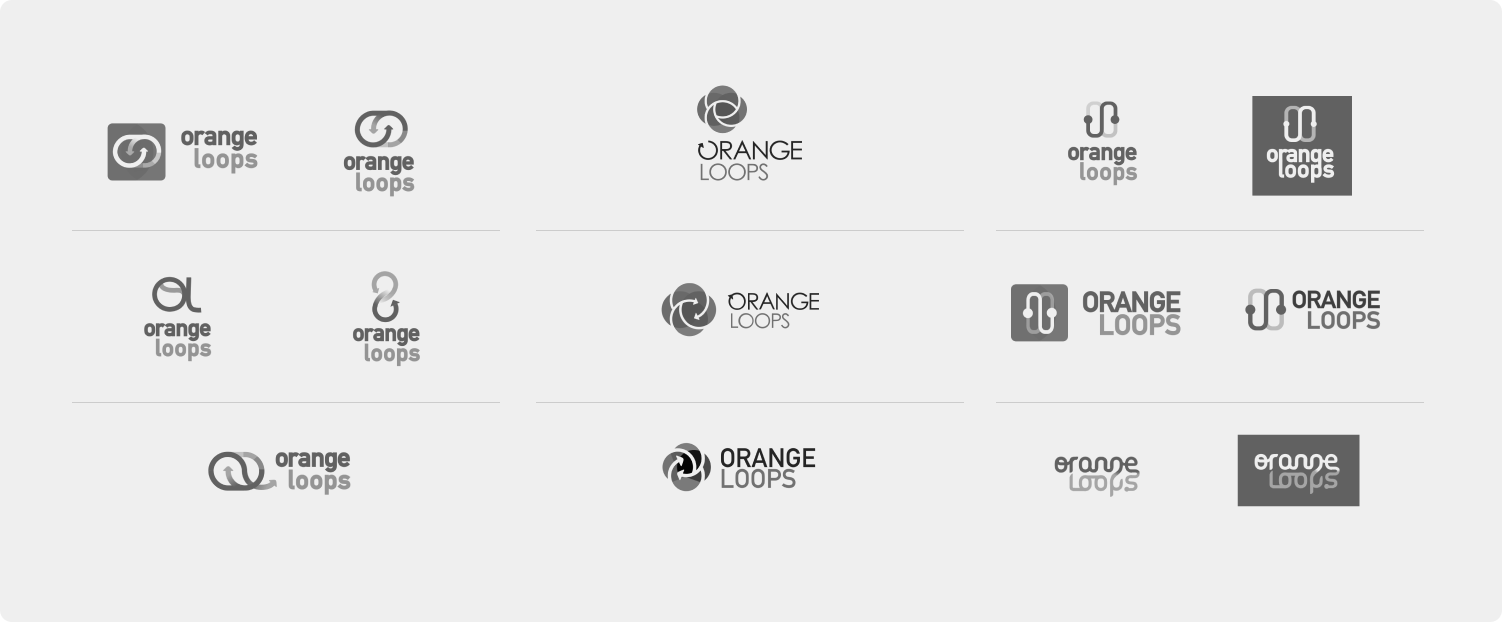
Once the options were narrowed down, the selection process began with options that function well in black and white and have the most potential before moving on to the color stage.
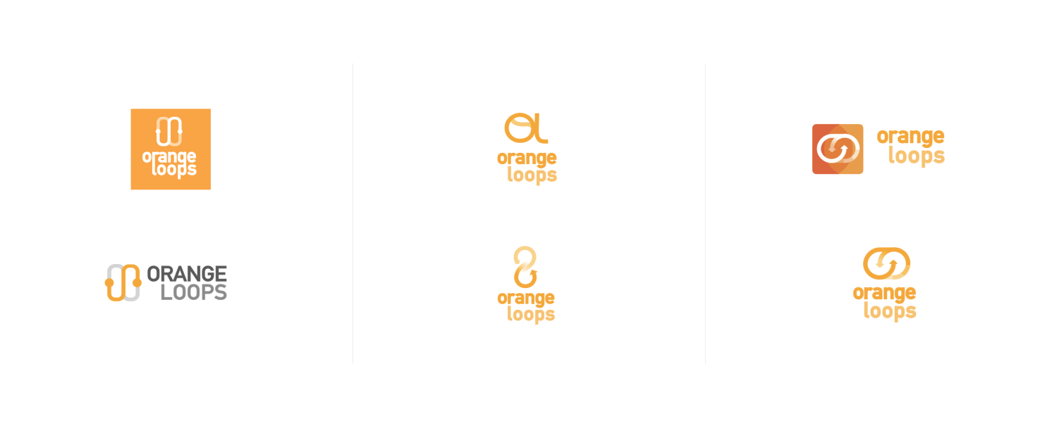
Brand Manual
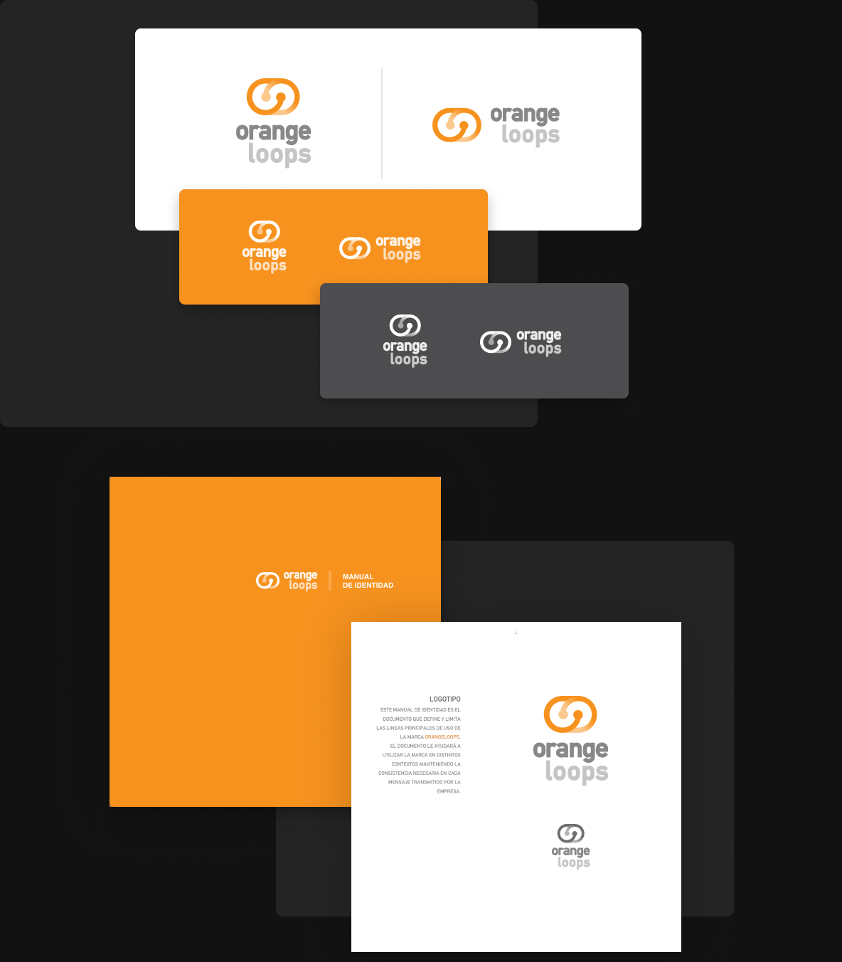
Once the path has been defined with the stakeholders, we begin with the stage of defining and fine-tuning the brand. This allowed us to provide the client with a brand manual so that they can use the logo in the different contexts of the company without the need for a designer.
Applications
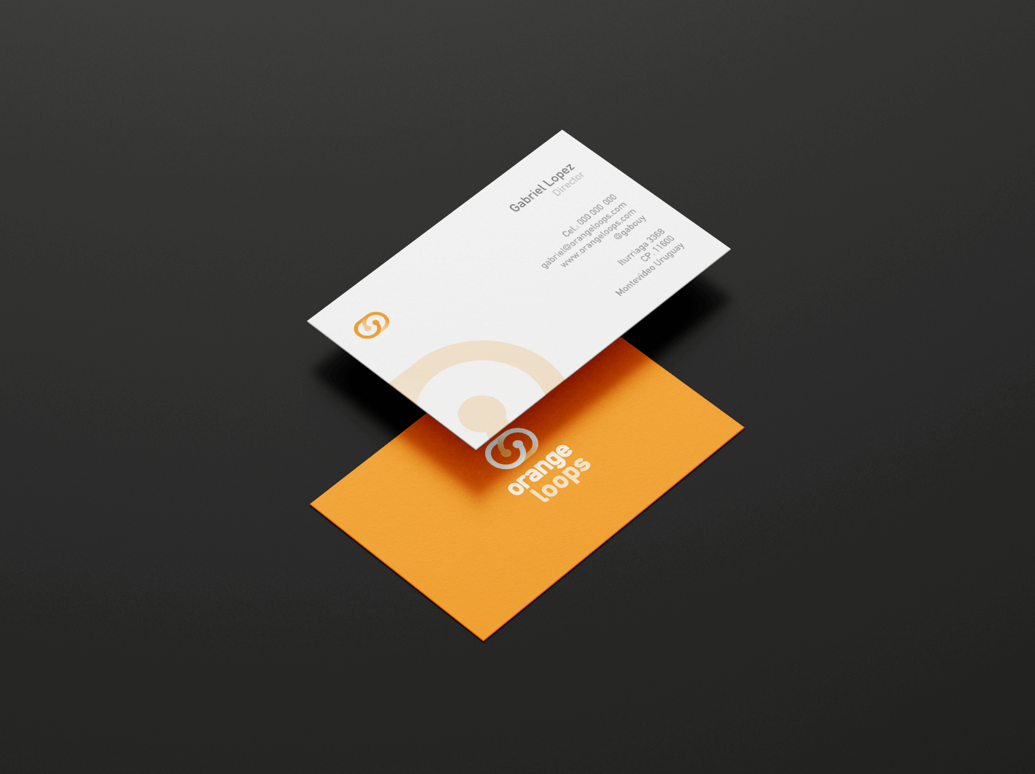
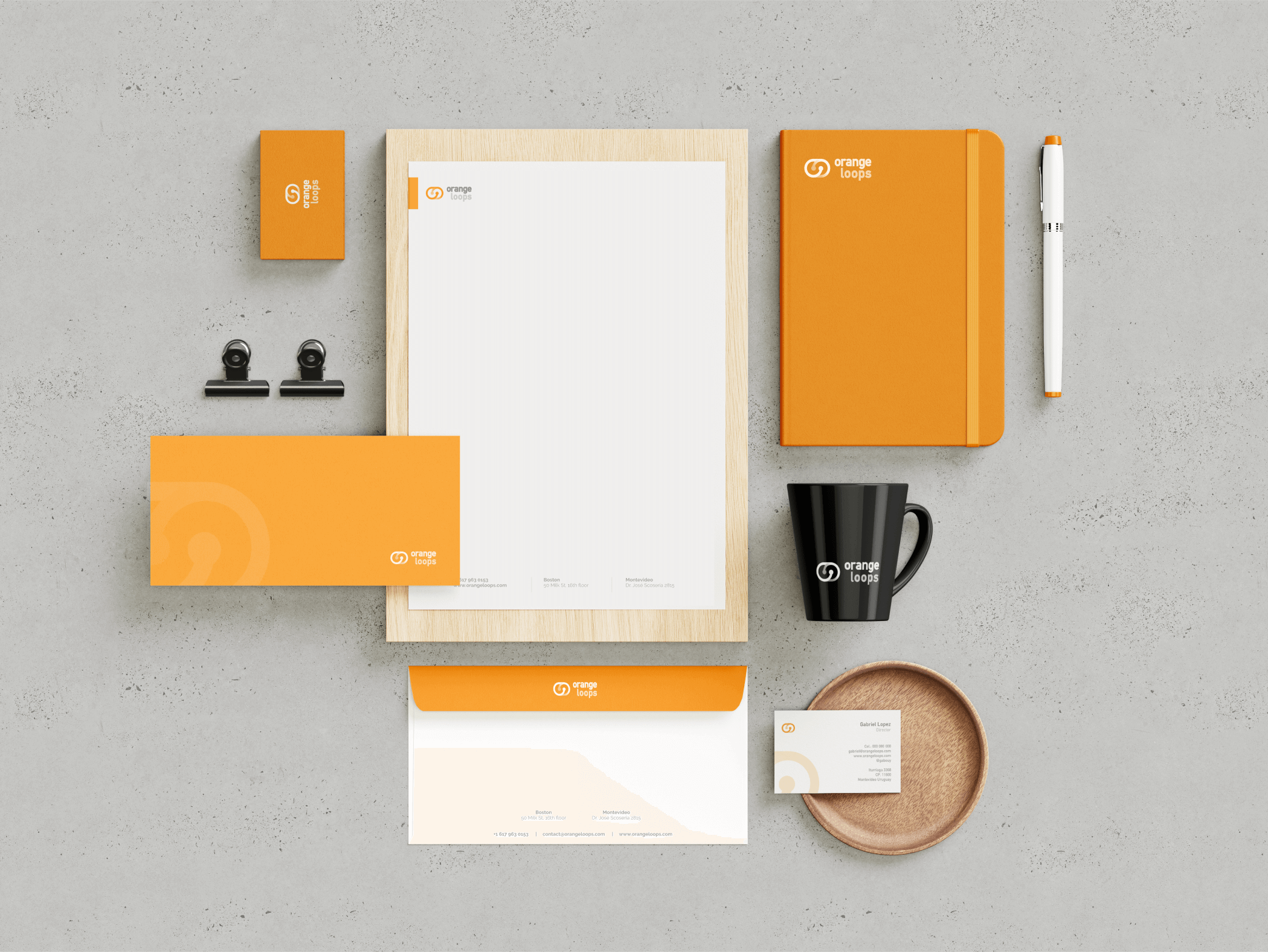
To complete the identity project, different institutional pieces were created to showcase the potential of the logo, color palette, and typography defined in the development process.
Working with Martin was a great experience. He understood our company and delivered a full brand manual that exceeded our expectations. The designer was professional, responsive, and detail-oriented, making necessary changes efficiently.
We're very happy with the final product and would recommend this designer to anyone looking for a creative and professional designer.

Omar Hagopian
