Challenge
The challenge presented by the company was to improve the customer experience with the agents and products already contracted, as well as to benefit them through upselling and cross-selling of the products offered.
Research
The research process began by investigating how the company works with its customers, what products it sells, how it serves them, and what type of communication they maintain. Understanding the audience that would use the tool, including their age group, level of technological knowledge, and usage, was essential to determine the type of solution to provide.
Solution
Create a mobile management and tracking application for the sales team to improve the customer experience with the products.
Navigation
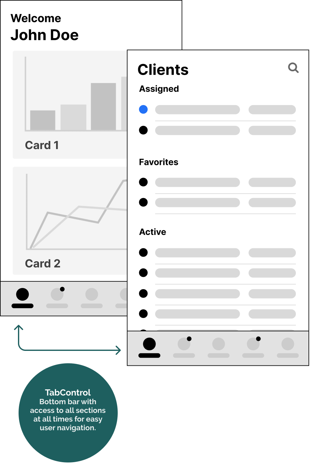
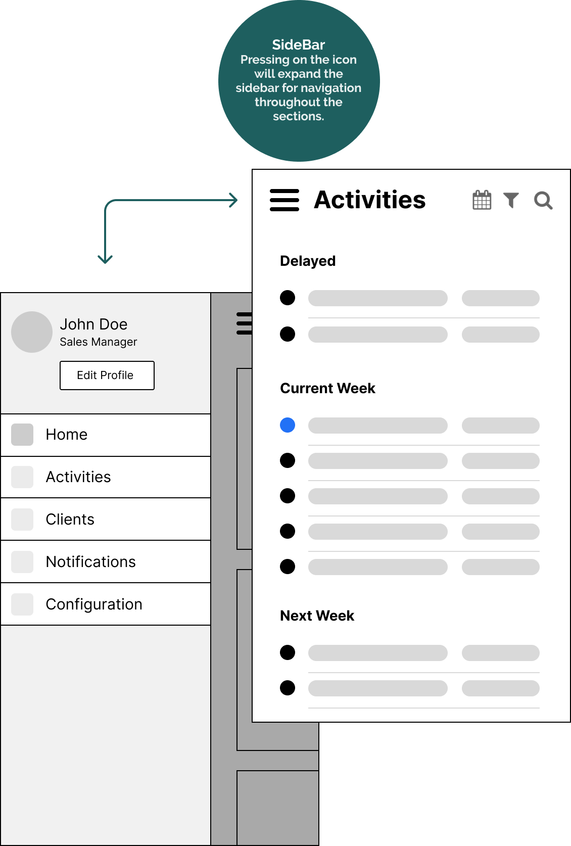
The process began by defining the information architecture and iterating on design patterns to provide easy interaction and understanding of the application. Two navigation proposals were presented using the Sidebar and Tabcontrol
After analyzing the pros and cons, the Tabcontrol was chosen as the navigation control due to its familiarity (compared to apps like WhatsApp) with the target audience who will be using the application.
Low fidelity prototypes
Several low-fidelity prototypes were created to evaluate interaction and screen layout..
Once the navigation was defined, the remaining screens were designed, including listings, search, filters, activities (create, delete, edit), calendars, products, analysis dashboard, profile, among others.
Agnostic design
Agnostic design After finalizing the interaction design and application flow, the base design (white label) was developed with the purpose of being personalized for other branches/clients in the future.
To achieve the white label, we worked with few accents and a reduced color palette to make it easily customizable without losing the highlights and important actions.
The hand-off of the delivered material to the development team was prepared in Zeplin with all the optimized design tokens (typography, colors, iconography, and components along with their grid with exact measurements), ready to be translated into the application's code.


